Today’s assignment: try out at least three other themes — even if you’re happy with the one you first chose. Try one you’re drawn to, and one you would never use.
I needed a new theme badly. I chose Book Lite early on because it was plain, clean and simple (“…wrapped up nice and tight…”)(sorry, I couldn’t NOT add the rest of the Van Halen Poundcake lyric). At the time I knew my blog would be very plain and simple for the foreseeable future. So I went into this exercise excited, but also, as usual, a bit apprehensive at what might happen when I tried to change things up. It actually wasn’t as scary as I thought. Probably because I only tried one theme. I immediately liked several things about it, including how it automatically shortened each blog on my blog page and included a “read further” element…something I had been hoping to figure out how to do. Bonus!
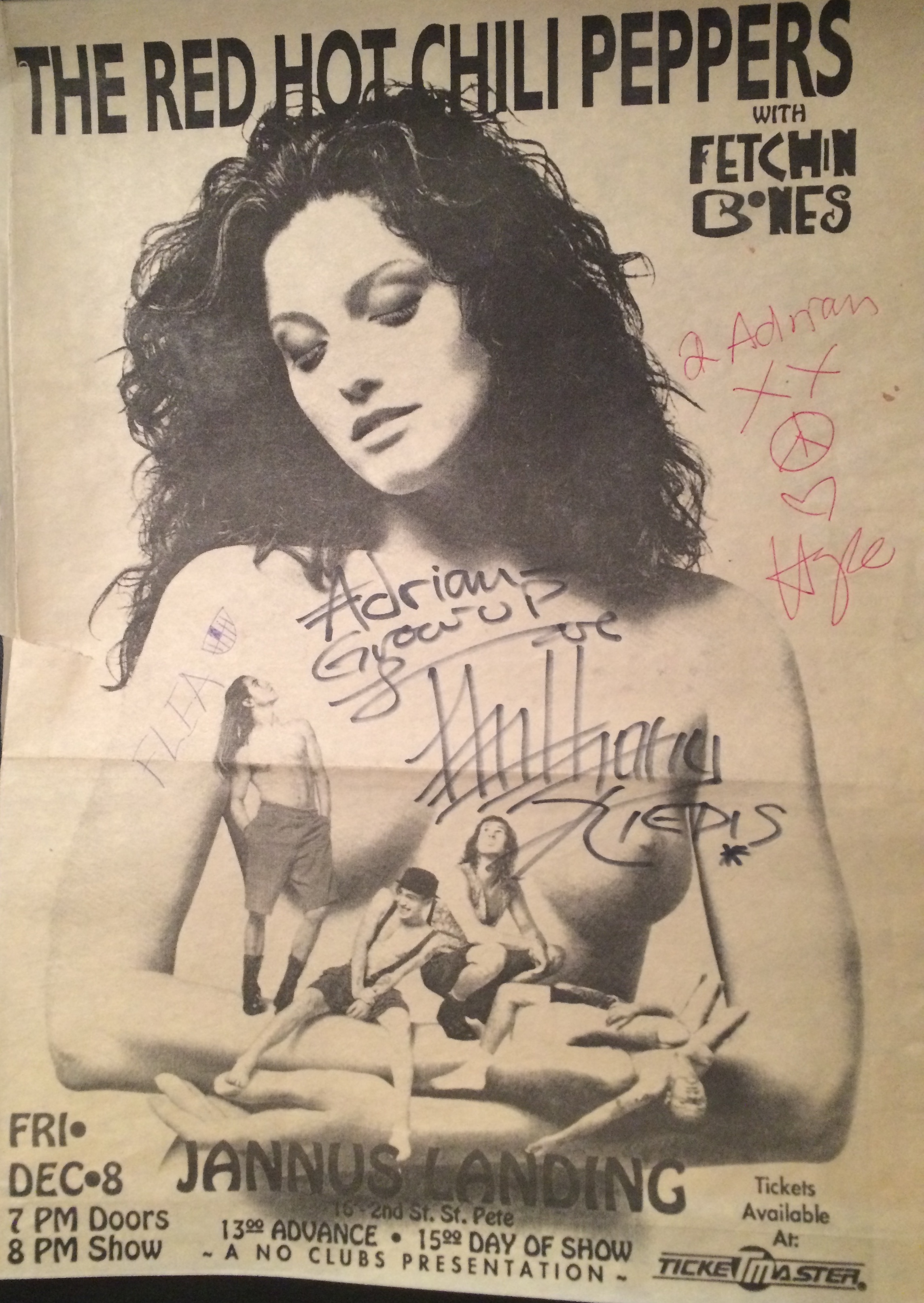
For those of you who had seen at my old theme, you will notice it now looks A LOT different. And it’s not because I spent all weekend figuring out how to do the sidebar and widget things. In fact I spent all day Saturday at the beach, and Saturday night wandering around the oh-so hip downtown St. Petersburg, Florida with two of my best girlfriends. Usually our trips downtown involve a show at Jannus Landing (or as they call it now, Jannus Live) or the State Theater or the Local 662. But this time we just went to the Emerald, the greatest dive bar downtown and possibly anywhere, and then walked around watching the masses of people, young and old, that throng down there now. I marveled at how different it is from when I used to ride my bike to Webb’s City in 1975, or went to see the Fanatics play at Club Detroit (now called Ringside Cafe) in 1983, or when I saw the Red Hot Chili Peppers Mother’s Milk tour at Jannus in 1989. It’s a fantastic and monumental downtown revival that warms my nostalgic soul.
But I digress.
I spent a mostly rainy Sunday morning looking through the Blogging 101 Commons blogs, the themes, and making a list of elements I thought might work for me. I then had a great one-and-half hour Google+ hangout session with Meilani MacDonald, online business consultant extraordinaire. She was able to view my screen in the “hangout” and direct me around my own site and on how to make all these fabulous changes. As you can see, I made a lot of headway! Yay! WordPress is also starting to be a little bit more intuitive to me, now that I am less afraid to click on things, have read numerous tutorials, and had a few logical explanations from Ms. MacDonald. Whew.
Although I really like how it looks right now, I intend to try a few more themes before I officially “launch.” My biggest complaint, which I didn’t notice until the sun went down, is that the font is too light (it seems grey instead of black) and too small. I have some really messed-up eyes, and after the sunny afternoon faded into dusk, I found myself having a hard time reading my own site. Sigh.
And lastly, being that I just learned how to add a “featured image” to my posts, I figured I had to have one – hence the Chili Peppers concert ad about the above-mentioned 1989 show. It was autographed to my son Adrian, who was 6 months old at the time. This ad was in his dad’s local music magazine…more about that later though. Gotta love the Flea teeth art! It works, right? ;o)